Chrome Hearts Redesign
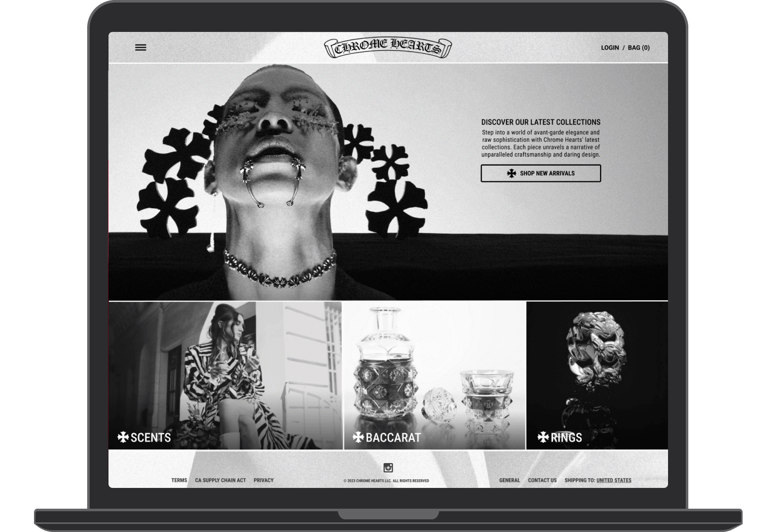
As a personal exercise I chose to do a review and redesign of a brand that interested me, Chrome Hearts. The original site is quite niche aesthetically, very barebones and not entirely obvious how to navigate it. I wanted to try to keep the brand's visual style intact but offer a potential improvement in some areas, particularly the landing page.
UI.UX
Conor Casey
Role:
Design
Date:
2021
My Process
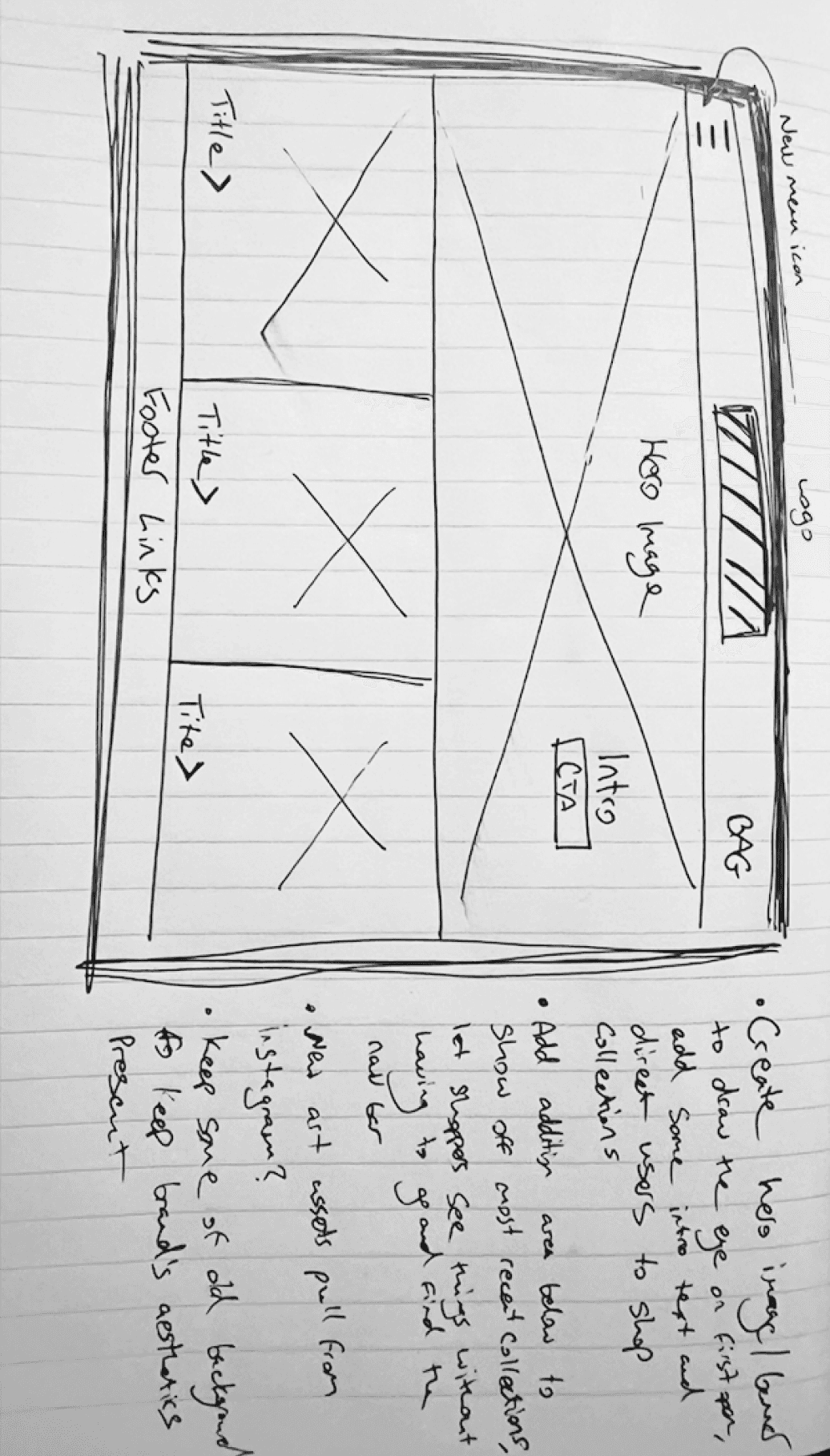
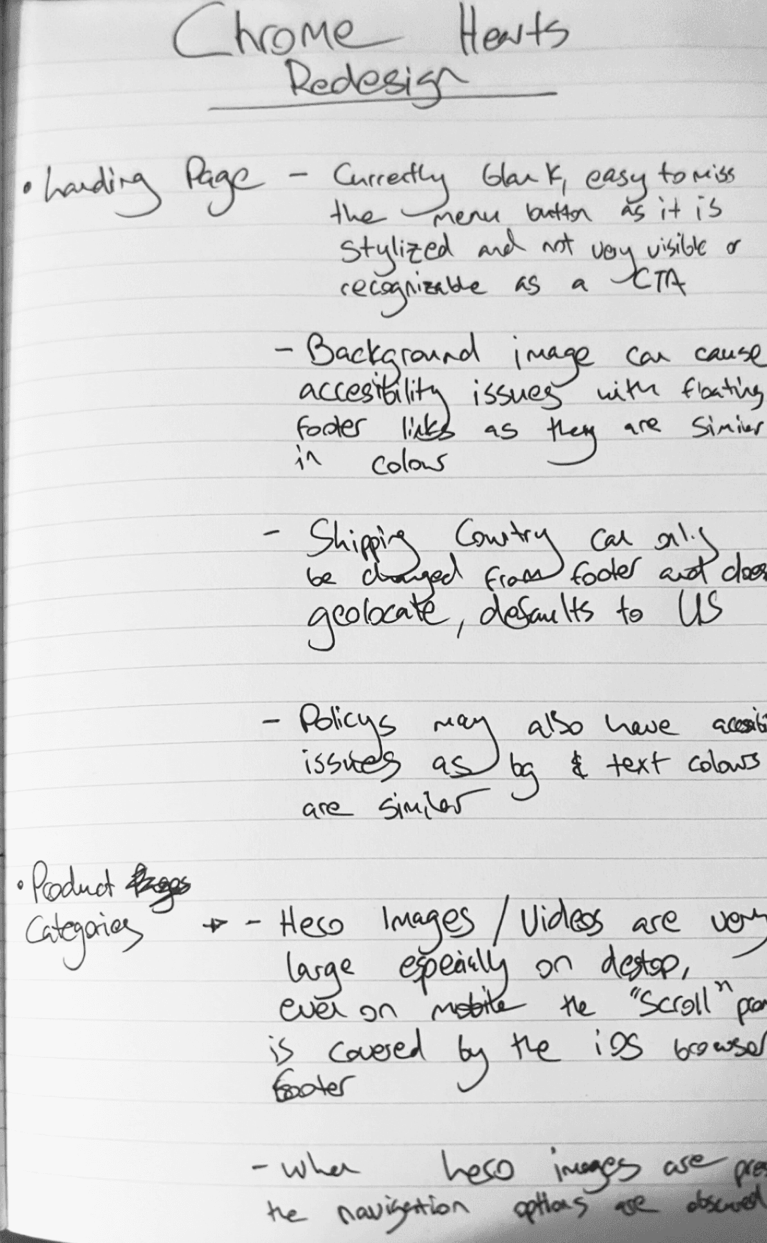
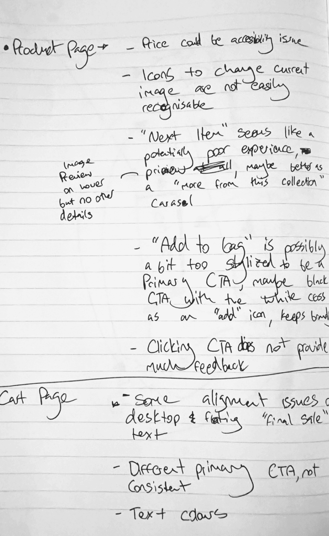
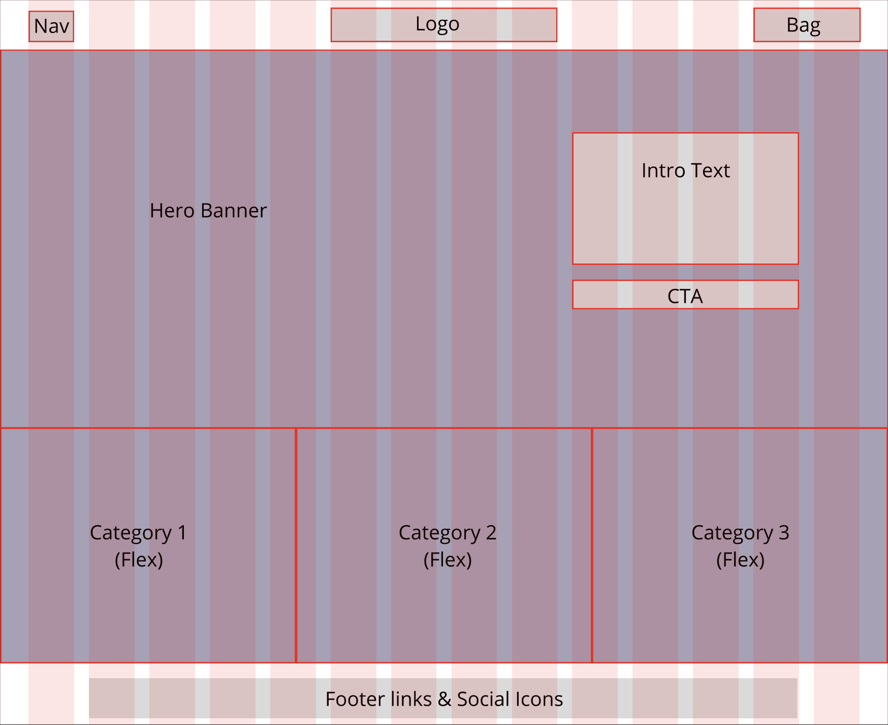
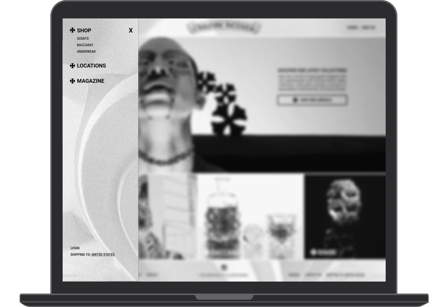
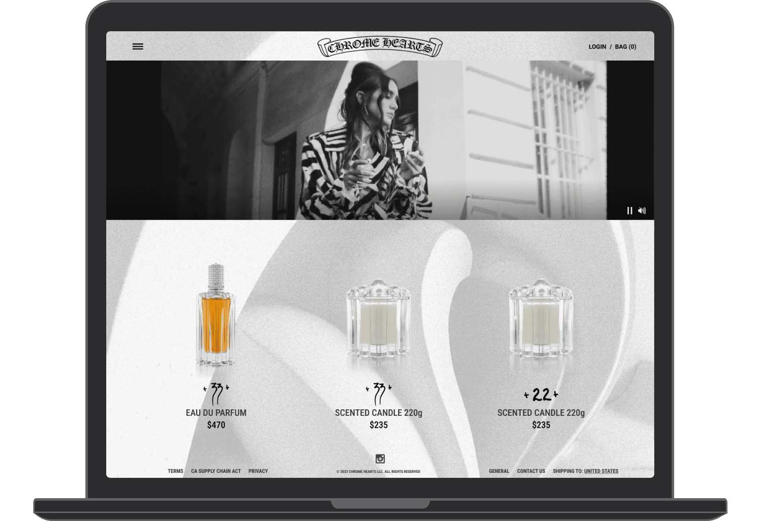
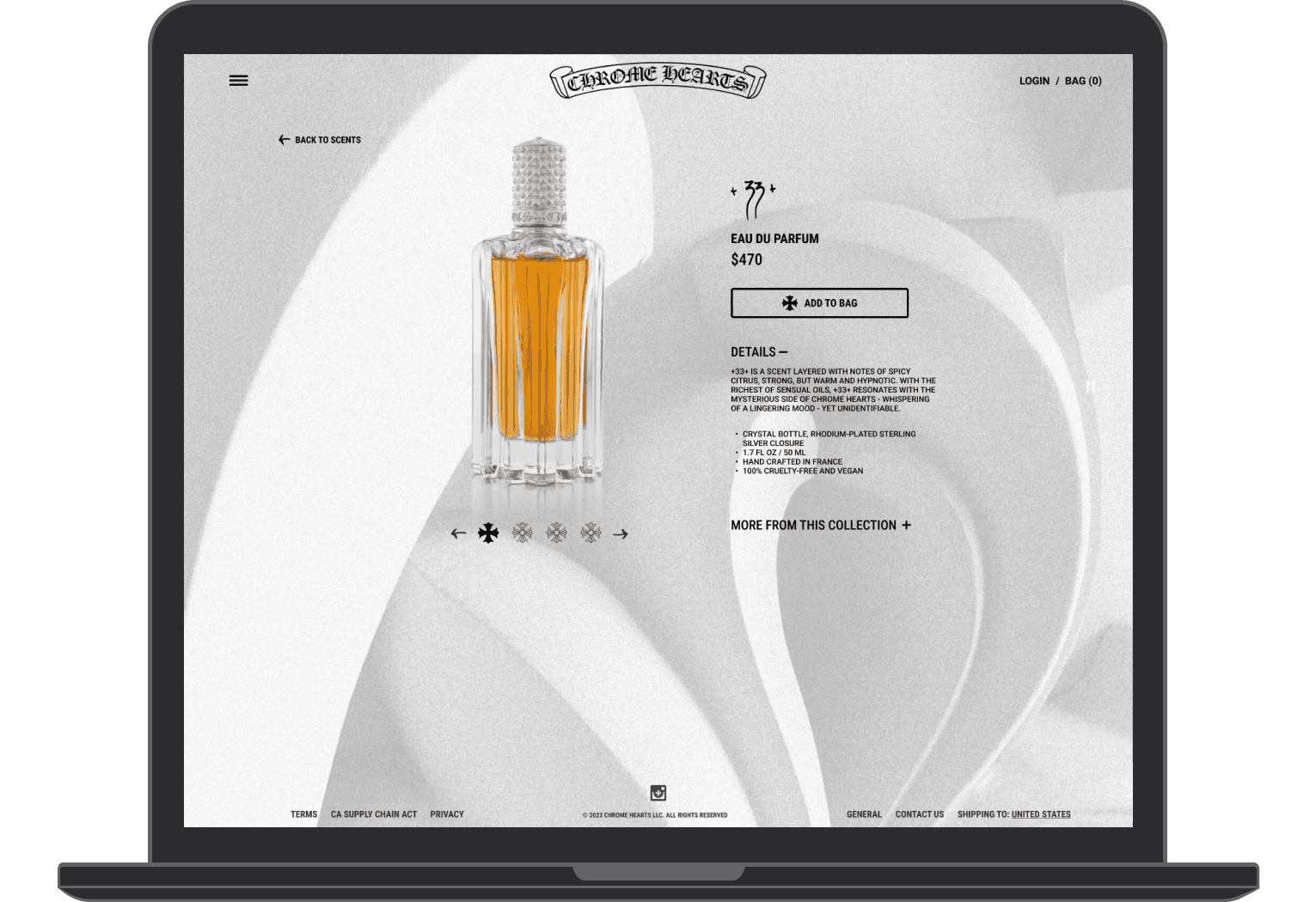
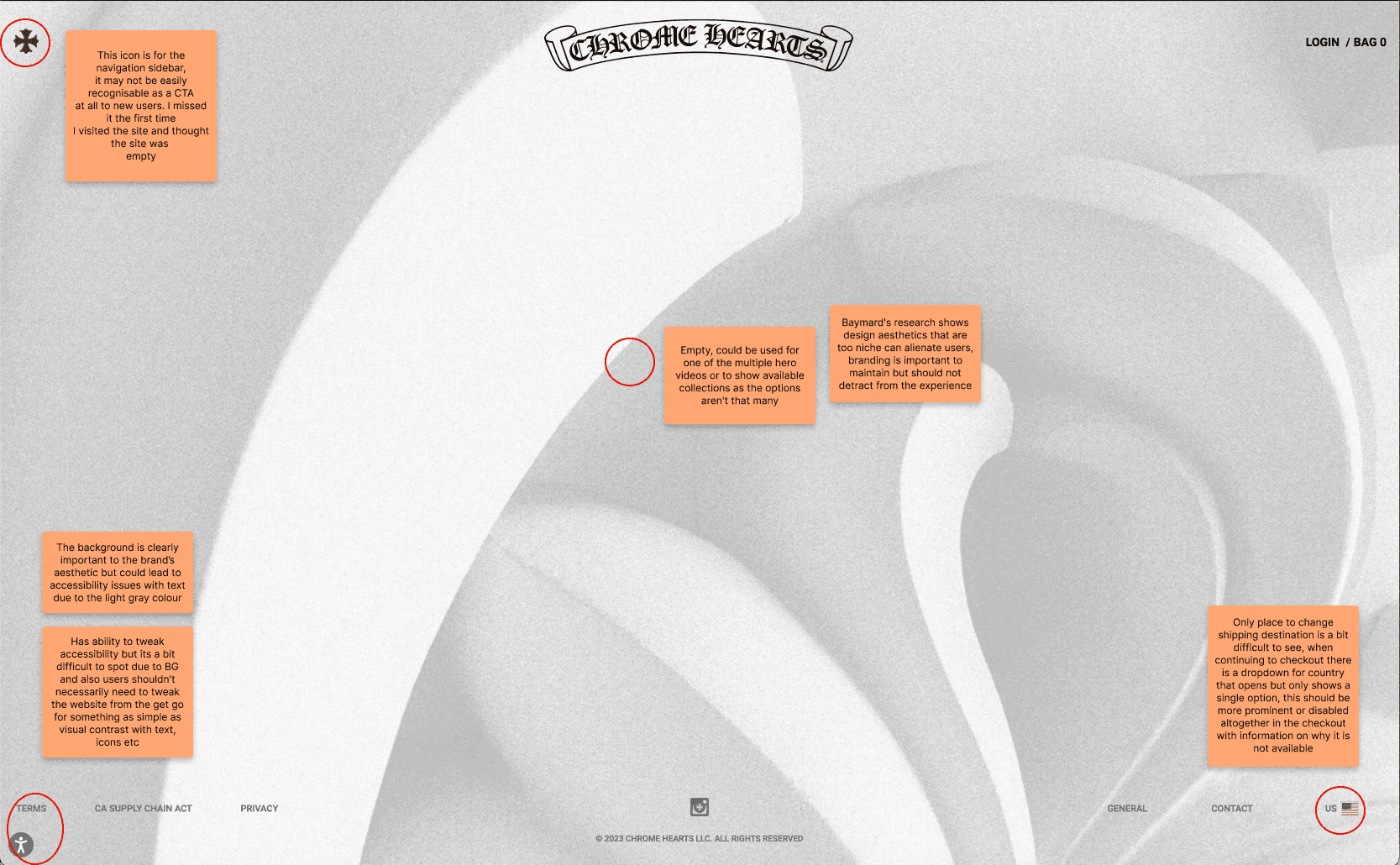
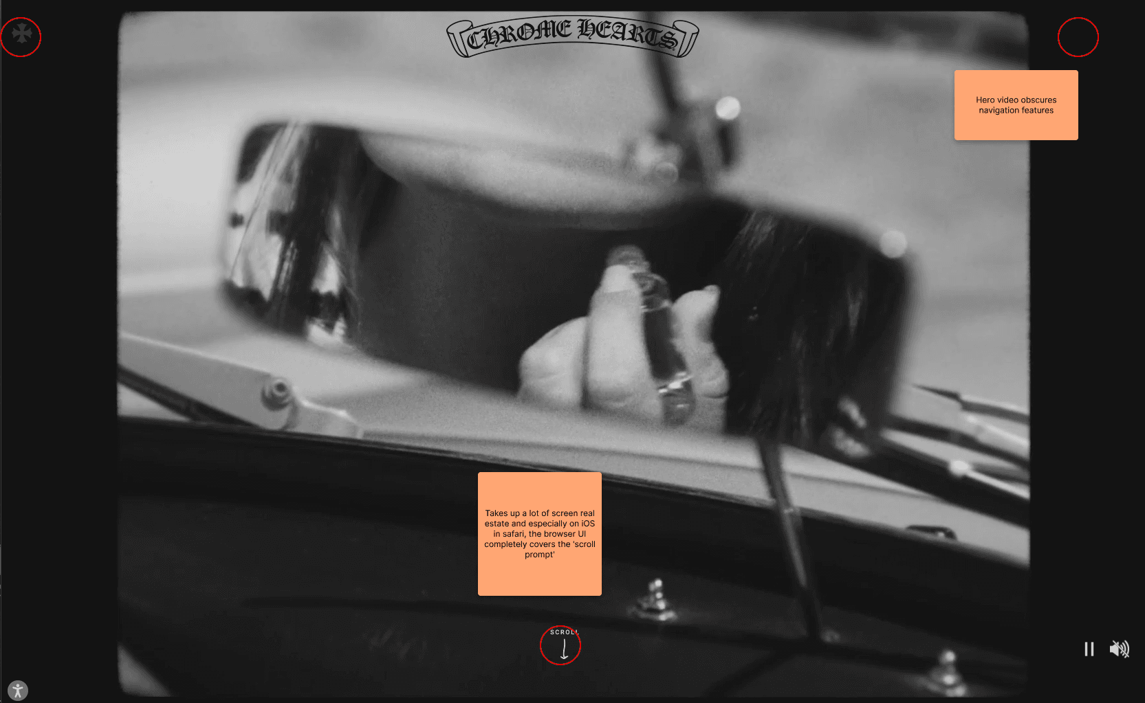
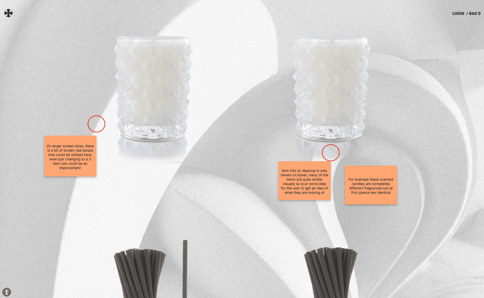
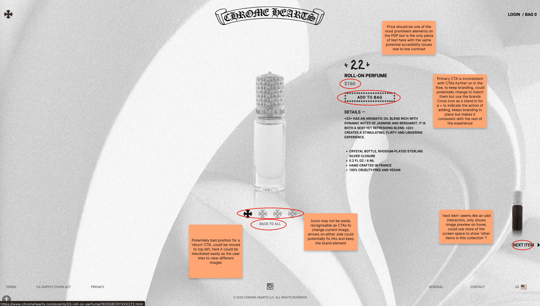
I began by going through the existing site, taking screenshots and noting down any potential issues and improvements while referring back to Baymard, a good source of existing research done on best practices for eCommerce sites. After compiling my findings I sketched out a rough wireframe of my new screens before creating high-fidelity mockups in Figma
Sketches & Solutions
The first point to consider after creating the persona was the need to learn the software and the frustration that it was a bit overwhelming with many different pages, some of which were not used. This could be solved by trimming and combining pages or even letting users choose which pages are visible to them, starting with just the basics and increasing over time as they get used to the software.